We program and integrate Beckhoff controls. Call us if you need help programming or starting up a Beckhoff system.
Posted to Nick KLeinjan's Blog on Jun 01, 2009
Background
I was asked recently by a customer to help correct some strange layout behavior that they were seeing in their website application using the Apple Safari browser. The client had been diligently building and testing their application using IE and Firefox, however a new user wanted to use Safari as well. When opening the site in Safari, one of the main div containers looked ghastly, and was pushed up and over the other two main containers that they had on the page. This behavior only occurred in Safari, not in IE or Firefox.
After some investigation of the source and stylesheet, the culprit was a stray position:relative css setting in the stylesheet. The other two browsers seemed to make different assumptions about how to display the page, and it looked fine, since even with the relative position setting. Because there was no top or left position properties set, the setting appeared to be ignored by these browsers.
So, now Safari looked great, but after refreshing the site in Firefox, now one of the containers that never had problems before was messed up! What a serious pain to try to keep your site looking nice in all these different browsers. And today, with the newest full mobile browsers on the iPhone, Blackberry, and (someday soon) Win Mobile, it is only going to become more and more of a challenging problem.
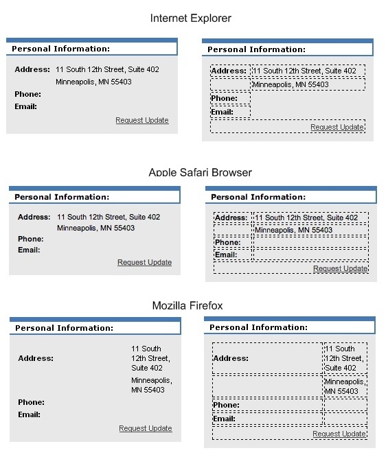
Table Width Problem
Here is the problem I saw in Firefox. Notice the right hand image for each browser table has borders added to more clearly see the table cells.
Solution - Short Term
The customer really wanted a quick fix to the problem, so after trying a couple .css changes, like border-collapse:collapse and empty-cells:show to no avail, I stumbled across something that fixed the layout, which was to add a width="0" attribute to the table tag as shown below.
<table border="0" width="100%" style="font-size: 11px;">
<tr>
<td>
<strong>Address:</strong>
</td>
<td>
.........
After making this change, the table looked basically the same in all three browsers. Another interesting point seen in these screenshots: IE does not put borders around the empty cells. Even with empty-cells: show; set for the table, the border does not show up on the right columns in the table. You need to add a &nbps; into empty cells for it to display like Firefox and Safari.
It is beyond me why a border="0" addition to the table would clear this up, but it fixed the issue quickly and the client was very happy with the result.
